


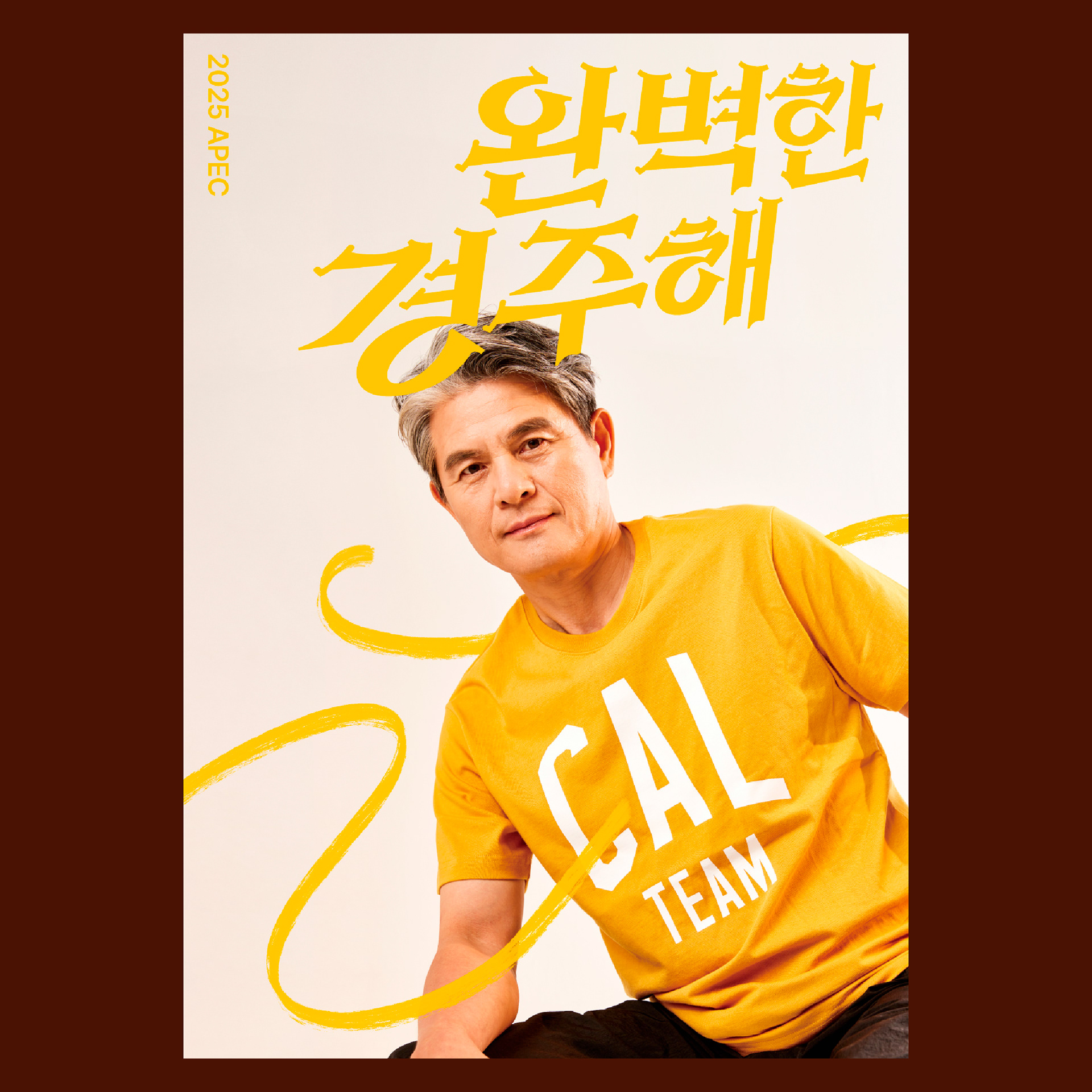
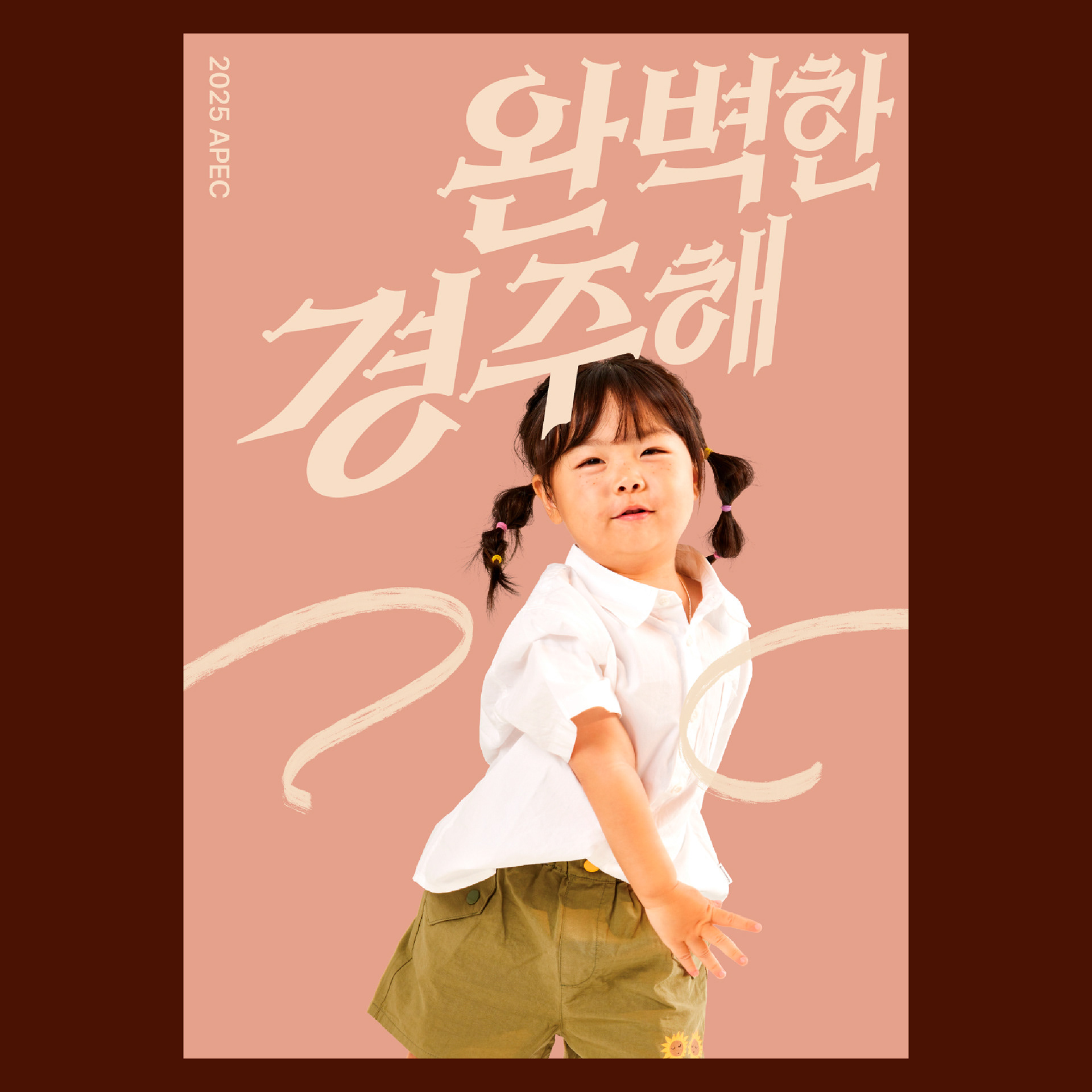


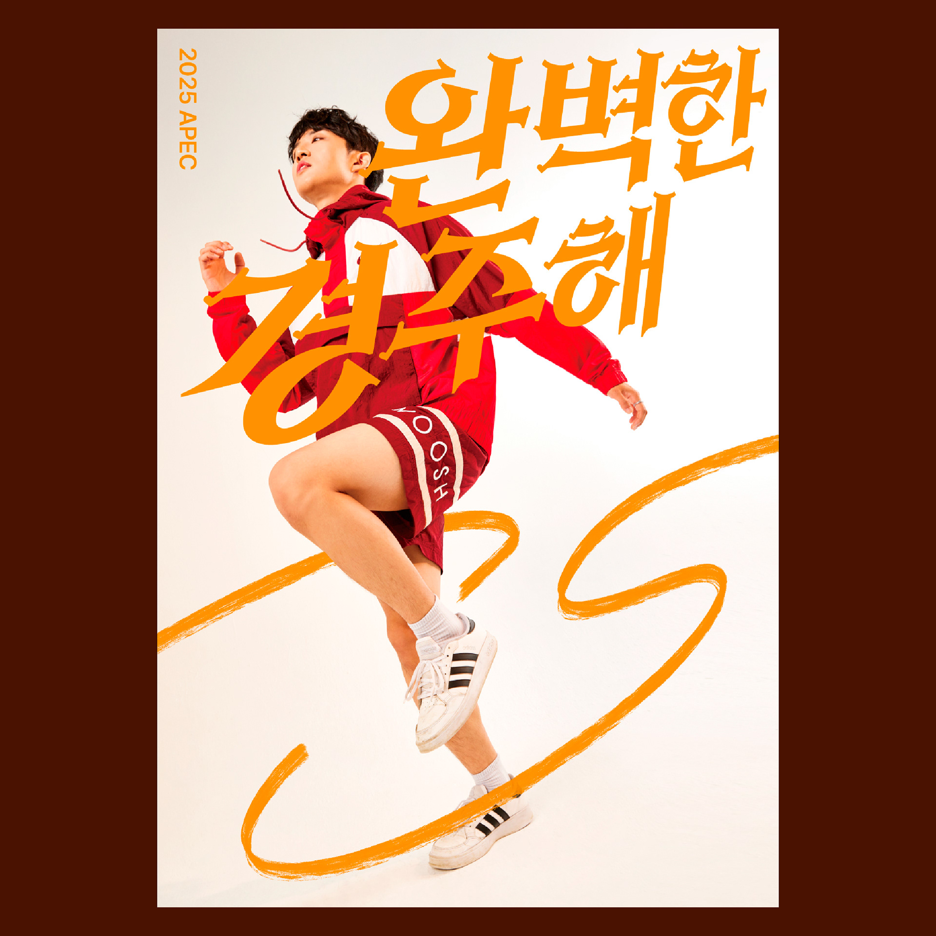
경주 apec 유치 홍보 포스터, '완벽한 경주해'의 탈락 B안입니다!
개인적으로 아쉬웠던, 레이스의 의미에 좀 더 집중한 시안입니다.
개인적으로 아쉬웠던, 레이스의 의미에 좀 더 집중한 시안입니다.
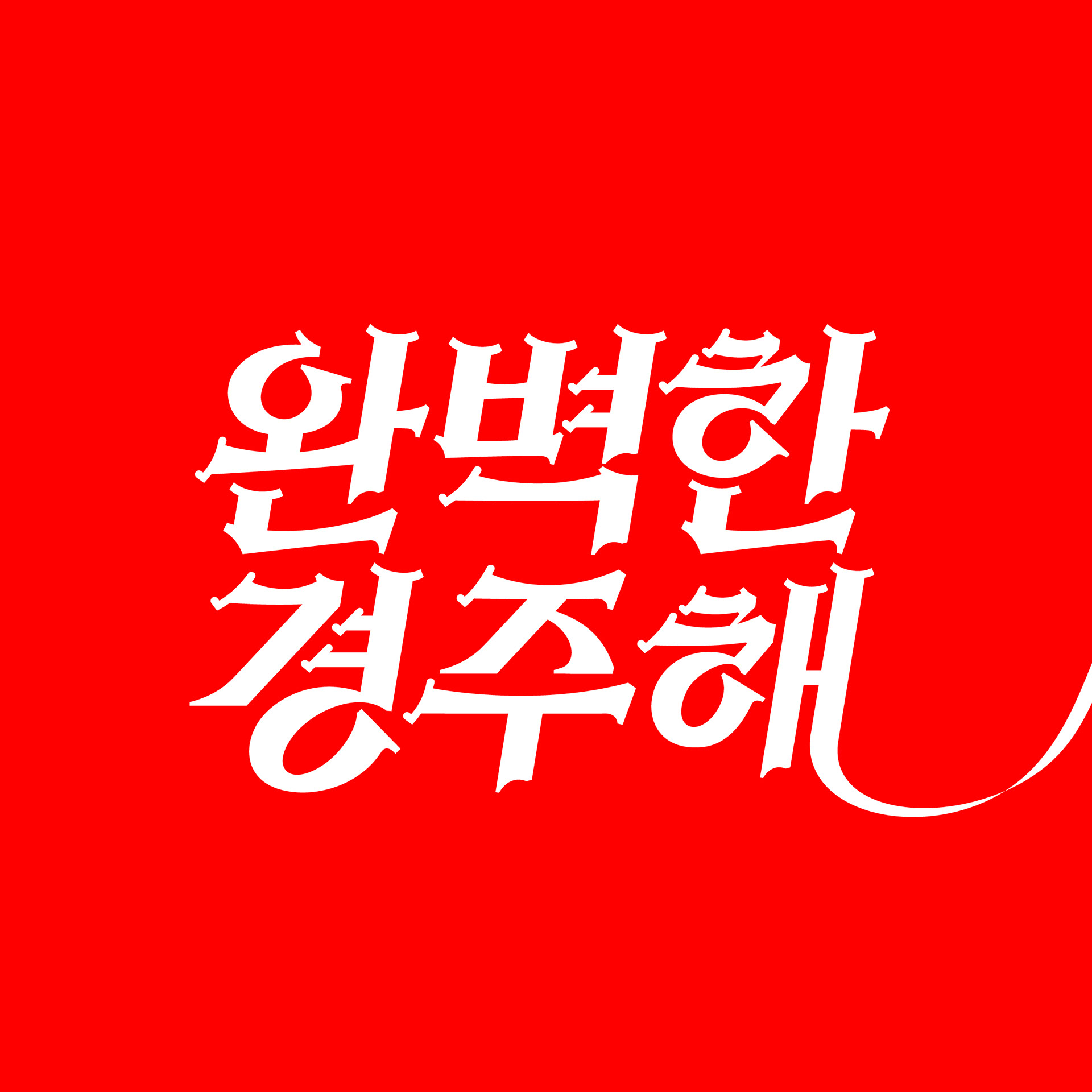
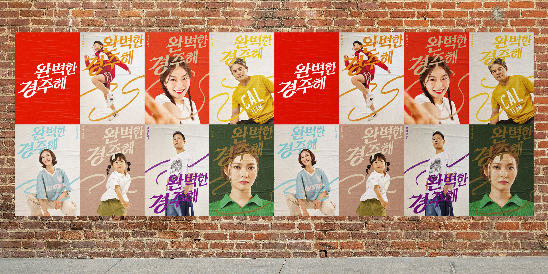
타이틀 레터링과 사진의 가공, 그래픽 작업을 통해
7종의 포스터를 완성했습니다.
경주의 지역명과 레이스의 경주를 중의적으로 표현하기 위해 한옥,
기와를 획에 표현하면서도 의욕을 불러일으키는
강인한 인상의 타이틀을 디자인했습니다.
A promotional poster for the attraction of Gyeongju apec,
this is the elimination B of 'The Perfect Race'!
It's a plan that focused more on the meaning of the race,
which I personally felt sorry for.
Through title lettering, photo processing, and graphic work
We have completed seven types of posters.
In order to express the region's name and
Gyeongju's race in a meaningful way, Hanok,
expressing the tile in a stroke, but also inspiring
We designed a title with a strong impression.
this is the elimination B of 'The Perfect Race'!
It's a plan that focused more on the meaning of the race,
which I personally felt sorry for.
Through title lettering, photo processing, and graphic work
We have completed seven types of posters.
In order to express the region's name and
Gyeongju's race in a meaningful way, Hanok,
expressing the tile in a stroke, but also inspiring
We designed a title with a strong impression.